Stuff cloud dancer!☹️
- Lucinda Crimson
- Jan 13
- 4 min read
This is the first letter of The Maximalist Mailer print club. December 2025

Kaya and wanju*
I’m excited to be starting this print club. I’ve started a lot of creative projects in my life – and a few of them I’ve even finished. I hope that this project doesn’t finish, or that it keeps going for as long as I can sustain it and long as people will support it. Thank you so much for supporting me and I hope it brings you happiness!
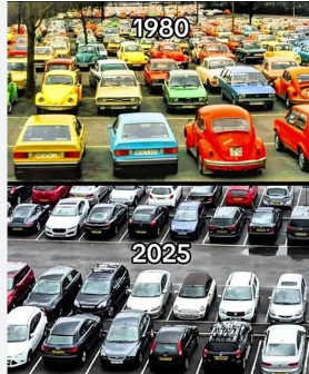
It feels very fitting to be starting this club and the week after Pantone announced that the ‘2026 Colour of the Year’ would be Cloud Dancer, an off-white colour. Their decision feels bizarre after the past few years’ trend of embracing a luxurious, eclectic, maximalist use of pattern and colour – we thought we’d kicked landlord’s white to the curb.
Of course, to many of us maximalism isn’t a trend. It’s just how we live because we like stuff. I love stuff and I’m always trying to tread the tightrope between collecting and hoarding. A few years ago, when I started painting again, I painted ‘portraits’ of some of the objects that I’ve collected. Many are broken. Many have bits missing. Many of my tin toys have their propellers broken off and many of my enamel kettles have their innards burnt out; but as these beloved objects have become my housemates, I struggle to toss them. In an exhibition in 2022 I thought that I could give away these objects with their paintings, but it turned out that I was too attached to them, so I put them on display and then took them back home to my teensy little one-and-a-half bedroom duplex.
I don’t feel qualified to address if maximalism is embracing or appropriating the exotic or the ethnic or non-white cultures. There’s a British and European history of pattern design, but the riotously bold and colourful has belonged to the non-Caucasians. That’s one of the reasons that it’s so disappointing, in our current political climate, to have the American-based company Pantone declare that Cloud Dancer is the colour of the year. While Pantone have suggested that white is a neutral colour, we know that it is never neutral - it is loaded politically. I used to never want white walls in my house, because I like a Rothkoesque amount of colour, but I now love white walls as a background to make all the colour pop. It is just a background though, not an entity within itself. It’s not a hero colour. It is bereft of emotion and life.

I didn’t expect this letter to become political, but obviously colour has power. Pantone’s annual choice of colour has immense influence over the fashion and interior design worlds; it determines what colour fabrics will be printed, the look and style of furniture for the coming year and it sets the tone for marketing and branding in in a variety of industries. Globally, design has been white-washed over the years, as mass-production has led to simplification. You can’t have your curtains or carpets or cars in a range of colours – the cheap default is white or neutral. A quote from The Pigeon Letters, “What we call ‘minimalism’ might be industrial convenience dressed up as ‘taste’.”

When I was a clothing designer, my mission statement was simple; to bring colour to the people. I was somewhat self-conscious that my occupation was unimportant, but I used my skills to advocate for social justice and animal welfare whenever possible. My favourite moments were teaching the leader of The Greens’ Christine Milne and Senator Scott Ludlum to screen-print and printing hundreds of T-shirts to help the election of the senator (I was thanked in his maiden speech) and, years later, to screen-print T-shirts for the Roe 8 campaign to save the Beeliar wetlands. It’s handy having art and design skills – art is political!
The inaugural Maximalist Mailer’s print, Shiny, Bright, Fresh and Crisp, was the first of the collection of still-lifes that I’ve painted with a patterned background. I tried to bring my love of pattern and objects together in this one and it laid the path for the paintings I’ve done since. I have a beautiful old (and broken) red wall unit in my hallway that displays this packet of laundry powder that I got from a laundromat in

South Fremantle (decades ago!) and a packet of popcorn that I think I got from a cinema when my daughter was small, and I’ve kept them for so many years because I love their packaging. Simple and bold and bright and fresh and crisp.

I sold this painting to a gorgeous young, colourful couple - it was their first purchase together. The young woman was a vibrant stylist, and I like to think she’d be very disappointed with Cloud Dancer.
I would love to hear your thoughts on maximalism, colour, pattern, beloved objects, political issues and Cloud Dancer. If you would like to share them, I love this to be a community but of course it can be as one-sided as you’d like.
Oh, and the sweetest thing, a couple of friends and fellow small business owners (the fabulous Freo Florist and Urban Forager) decided that the colour of the year
should be Lucinda Crimson!

Thank you so much for subscribing to The Maximalist Mailer and I hope you love the print**
x looch
*For those not in WA, kaya means hello and wanju means welcome in the Noongar language. I am writing this from unceded lands of the Whadjuk Noongar people.
**this is written without AI, so this is very unapologetically in my voice, and I claim all grammatical errors.


Comments